Porsche Vs Ferrari Logo: A Deep Dive Into Two Iconic Symbols
Share

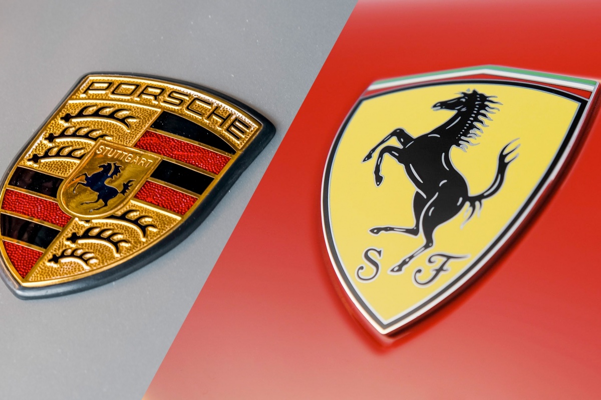
When enthusiasts think of high-performance sports cars, two names instantly come to mind: Porsche and Ferrari. While their engineering marvels, performance capabilities, and heritage are often discussed, less frequently highlighted is the significance of their logos. The logos of Porsche and Ferrari are more than just visual symbols; they are the embodiment of decades of history, passion, and dedication to the automotive world. In this blog post, we delve into the captivating stories behind the Porsche and Ferrari logos and analyze how they represent the brands themselves.
The Porsche Logo: A Symbol of Heritage

The Porsche logo is as iconic as the cars themselves. Introduced in 1952, the emblem features a black horse rearing up against a yellow background, surrounded by a red and black border adorned with the words "Porsche" at the top and the city crest of Stuttgart at the bottom. The horse honors the city of Stuttgart, which was renowned for its horse breeding, while the colors and design reflect the rich heritage of German craftsmanship.
The Porsche logo's design is a reflection of the brand's commitment to excellence and innovation. This emblem isn’t just a pretty design; it tells the story of the company's deep roots in racing as well as its steadfast commitment to quality and performance. Over the years, the Porsche logo has evolved but has always retained its reference to the brand’s origins, making it instantly recognizable.
The Ferrari Logo: A Symbol of Speed and Passion

In contrast, the Ferrari logo, with its iconic prancing horse, symbolizes speed, power, and a racing pedigree. The logo, first used in 1929, features a black stallion on a yellow background, representing the city of Modena, Italy. The colors of the Italian flag—green, white, and red—are emblazoned at the top of the logo, making it an emblem of Italian pride and automotive excellence.
Enzo Ferrari chose the prancing horse as a tribute to Francesco Baracca, a World War I fighter pilot who had the horse painted on his aircraft. After Baracca's death, his mother encouraged Enzo Ferrari to use the horse as a symbol of good luck. The logo has since become synonymous with some of the fastest and most luxurious sports cars in the world, embodying a spirit of competition and success.
The Design Philosophy: Visual Identity of Excellence

The design philosophy behind the Porsche and Ferrari logos presents a fascinating lens through which to view the brands' identities. Porsche's logo conveys a sense of tradition and stability—key characteristics that reflect its engineering prowess. The meticulous attention to detail evident in each iteration of the logo complements the brand's dedication to performance, making a lasting impression on aficionados and casual fans alike.
Ferrari, on the other hand, opts for a more dynamic and vivid design. The prancing horse exudes a sense of forward momentum and thrill. It captures the essence of racing adrenaline and evokes feelings of speed and power. The Ferrari label is a promise of high-octane performance, charisma, and exclusivity that resonates deeply with enthusiasts.
Cultural Influence: The Brands in Popular Media
Both brands have established themselves as cultural icons, not only in the automotive world but also in the media and entertainment sectors. The Porsche logo often appears in films and video games that emphasize precision and performance, whereas Ferrari's logo is typically associated with narratives of speed and daring competition.
Car enthusiasts often see vehicles from both brands as status symbols; they convey a lifestyle and an identity that speaks to personal values, aspirations, and tastes. It's no surprise that their logos have become imprinted in popular culture, serving as beacons of excellence in automotive engineering.
The Rivalry: Porsche vs Ferrari

The rivalry between Porsche and Ferrari is legendary, particularly in motorsports. This competition has fostered innovation and has inspired both manufacturers to push the limits of performance. While this rivalry extends far beyond their logos, the symbols themselves encapsulate the essence of the battle between these two giants—one rooted in German engineering and the other in Italian passion.
The Porsche logo, representing resilience and engineering precision, contrasts sharply with the Ferrari logo, which stands for speed and flair. This juxtaposition of characteristics continues to ignite loyal followings and heated debates among enthusiasts.
Conclusion: More than Just Logos
In conclusion, while the Porsche and Ferrari logos may seem like simple designs at first glance, they are, in fact, a reflection of the rich histories and values of their respective brands. From Porsche’s emphasis on craftsmanship and quality to Ferrari’s embodiment of speed and performance, these logos serve as more than mere visual identity. They are symbols of what each brand represents and the legacies they are building—icons of the automotive industry that enthusiasts revere.
Next time you spot a Porsche or Ferrari on the road, take a moment to appreciate the artistry behind their logos. Recognize that they embody the passion, precision, and performance that define these legendary brands. Whether you’re team Porsche or team Ferrari, both logos carry stories that connect generations of automotive enthusiasts around the globe.
In this exploration of the Porsche vs Ferrari logo, we hope you’ve gained insights into the importance of these symbols. Now, as you consider your next sports car purchase or simply daydream about the thrilling world of racing, remember the history and meaning behind these prestigious logos. They are not just marks of identity—they are badges of honor in the realm of automotive excellence.